
Formula Equals
The Project
Company Overview
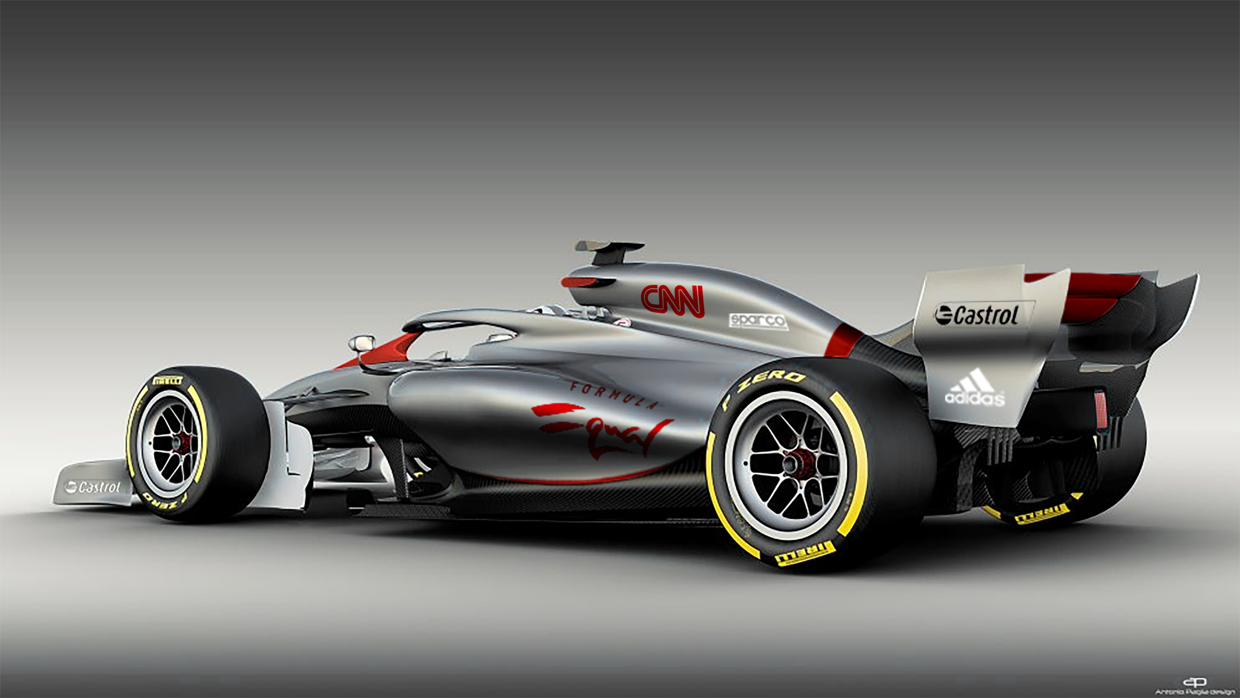
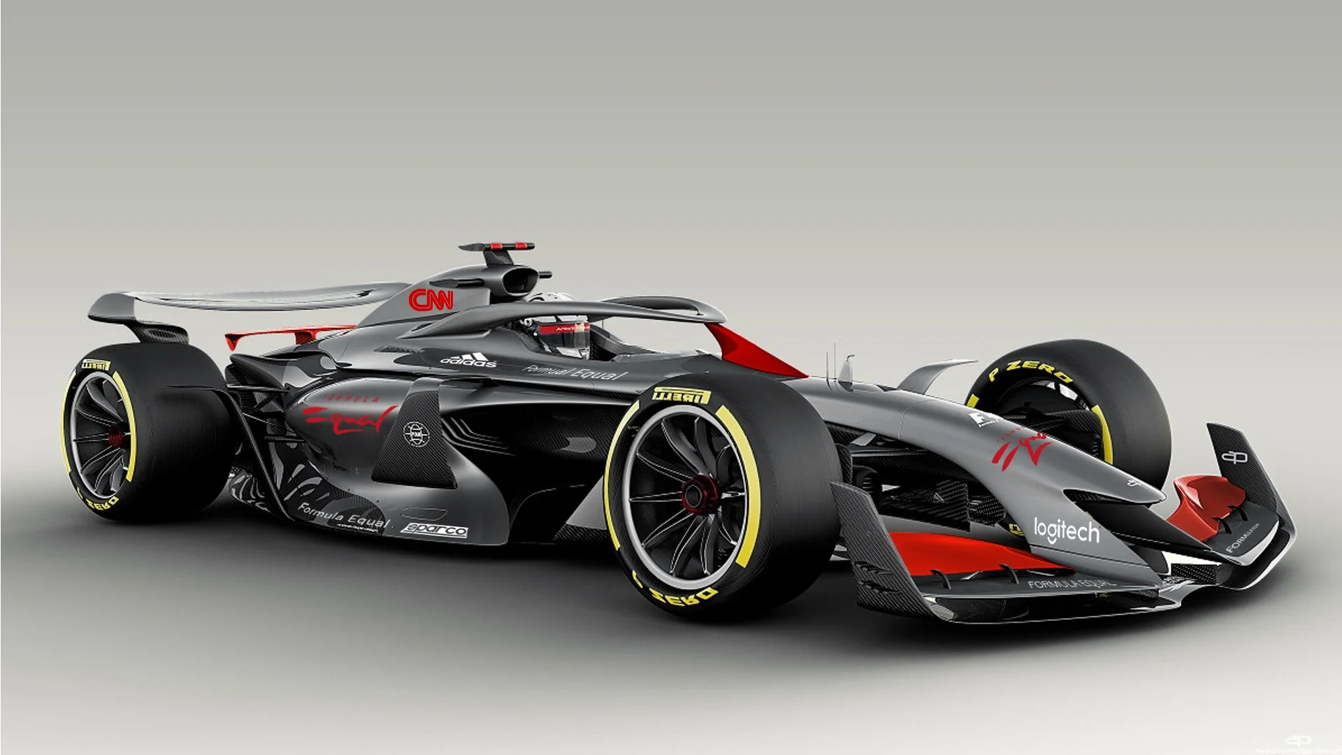
Formula Equal was a pioneering venture with a mission to redefine the landscape of Formula 1. Its core objective was to break the traditional mould of the sport by championing gender equality and inclusivity at every level.
The venture aimed to become the first F1 team with a 50/50 male-to-female workforce, from engineering and management to the driver lineup, with the explicit goal of fielding the first female driver in modern F1 history. Beyond the grid, Formula Equal sought to push boundaries and become a global platform for positive change, leveraging the pinnacle of motorsport to advance equality and inspire a new generation.
The Approach
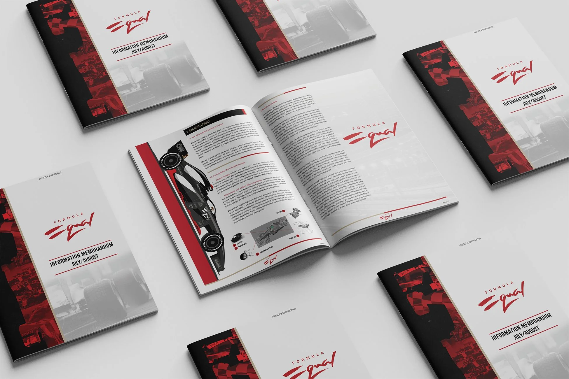
My design philosophy was to make the complex and revolutionary feel both inevitable and exciting. The visual language was built on a foundation of clarity, sophistication, and purpose.
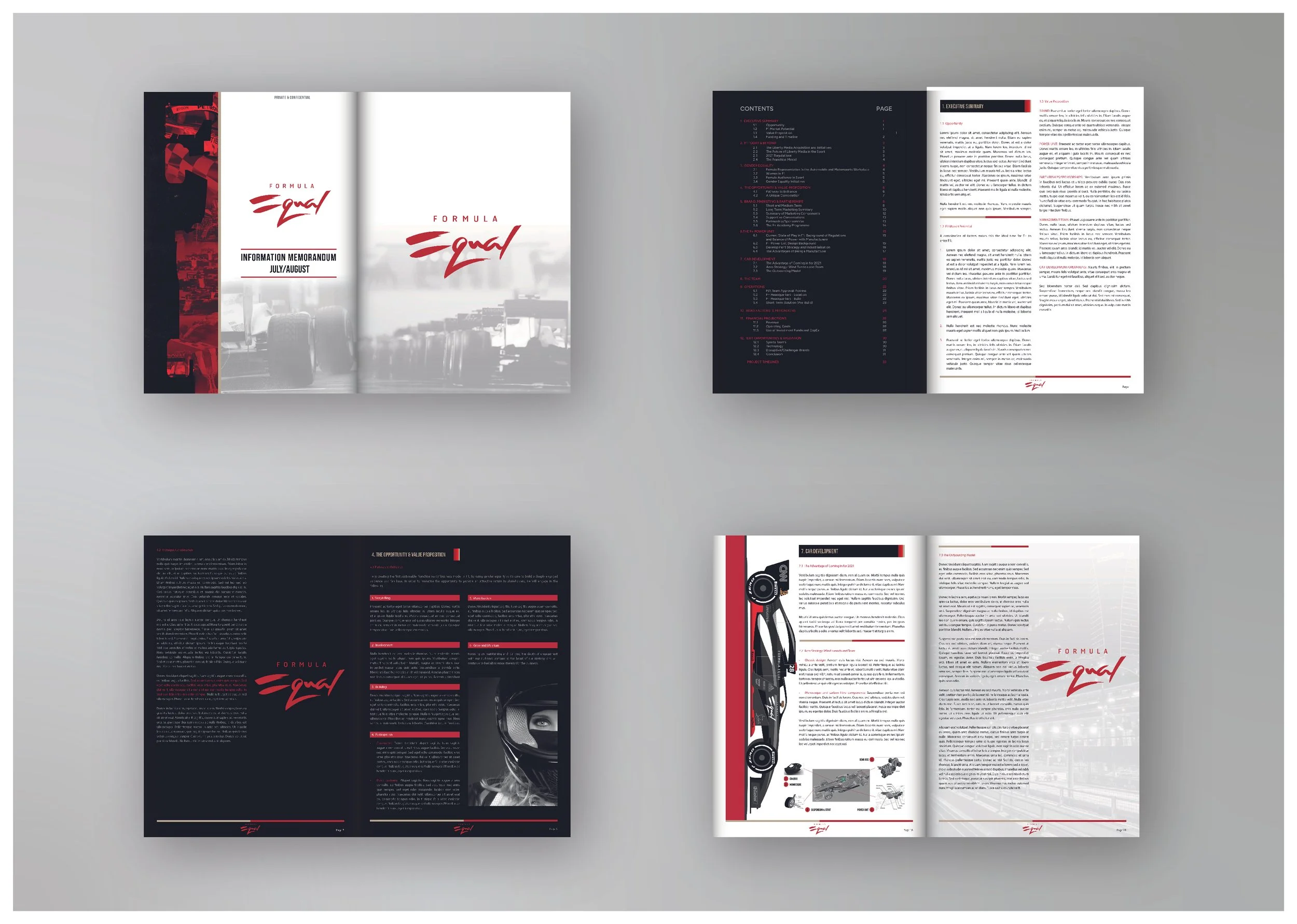
Crafting a Cohesive Visual Identity: I developed a design system that extended throughout the memorandum. This included a clean, confident typographic hierarchy, a restrained yet impactful colour palette, and the strategic use of the distinctive
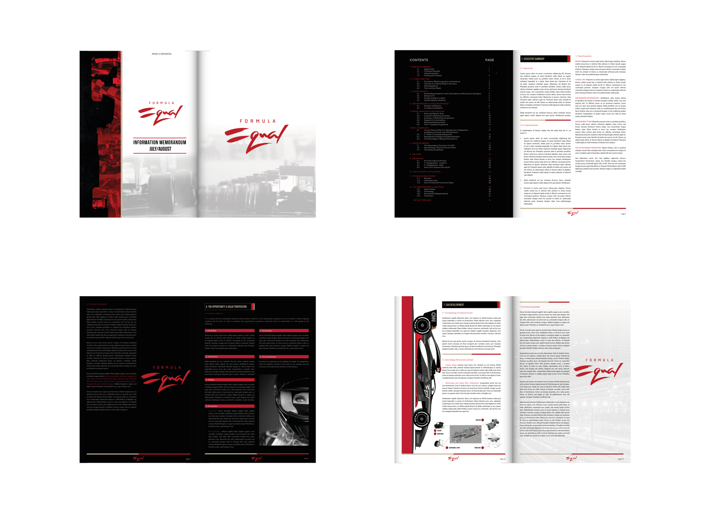
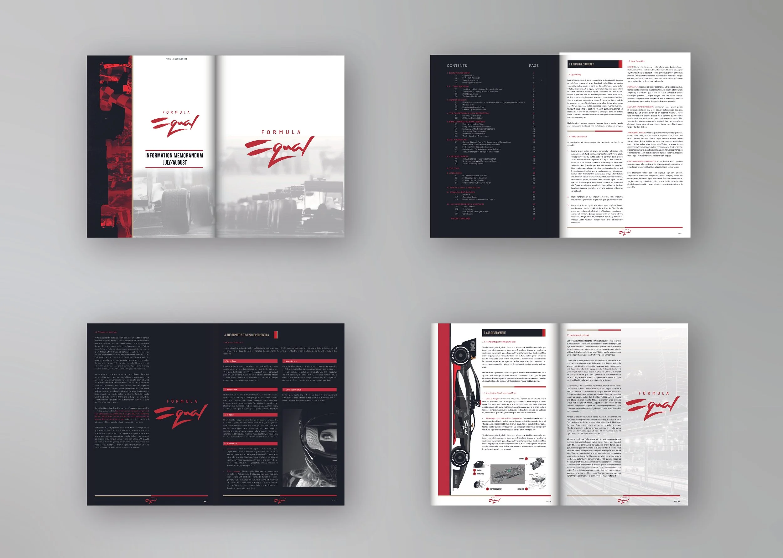
F=logotype. The identity was engineered to feel as precise and performance-oriented as the team it represented.Structuring a Compelling Narrative: I approached the 38-page document not as a dry report, but as a story. The layout was designed to guide the investor through a logical and persuasive journey: from the massive market opportunity, through the innovative solution, to the detailed financials. The use of clear sectioning, digestible data visualisations, and strategic pacing prevented information overload and maintained engagement.
Visualising Innovation and Disruption: The design aimed to translate complex technical and business strategies into accessible, compelling visuals. This included:
Creating clean diagrams to explain the proprietary power unit advantage and the lean operational model.
Designing financial tables that were both comprehensive and easy to parse, building confidence in the projections.
Using high-contrast, bold layouts for key value propositions to ensure the most disruptive ideas landed with maximum impact.
The Brief
To design the complete visual identity and create the key investor-facing document—the Information Memorandum—for Formula Equal (F=). This was not a typical F1 team launch; it was the introduction of a disruptive global brand built on gender equality, technological innovation, and a new business model for motorsport. The design needed to reflect this ambition, balancing corporate credibility with the energy of a movement.
The Result
The result is a visually cohesive brand that delivers clarity and trust for its audience. The illustration system provides an engaging way to communicate complex information, while the UI design ensures a seamless user experience. Together, these elements establish One Global UK as a distinctive and approachable brand in the banking and finance sector. This project demonstrates the power of thoughtful design in creating a brand that is both functional and visually compelling, capable of appealing to a global market.